Tour a Kitchen With Midcentury Modern Flair
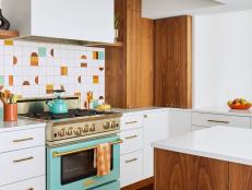
An Arvada, CO, couple turned their home’s ho-hum kitchen into a total midcentury stunner.
Cody Ulrich

Cody Ulrich
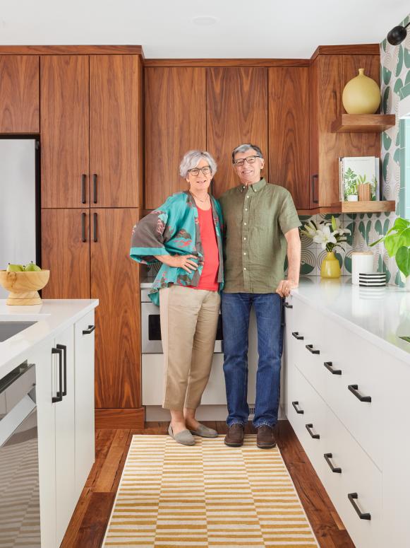
After living in their Arvada, Colorado, home for more than 20 years, retired educators Wendy Wheaton and Scott Bett finally decided to put their own stamp on the kitchen. The space was fine but nothing special — and it definitely didn’t reflect Wendy’s taste. “I remember going to my parents’ best friends’ house when I was growing up in the ’50s and falling in love with everything about their home’s midcentury style,” says Wendy.
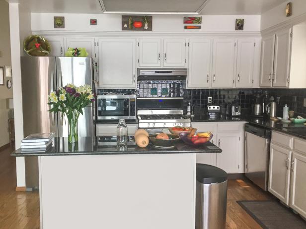
Before: This ordinary kitchen did the job but lacked personality.
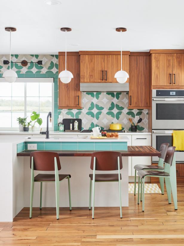
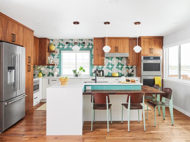
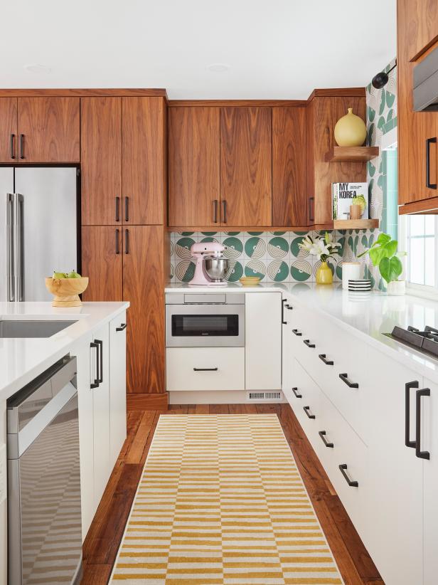
Inspired but unsure where to begin, she reached out to designer Ashley Christensen to help her create a memorable space full of retro flair. They reconfigured the island, swapped the blah cabinets for walnut uppers and sleek white lowers and replaced the stark black backsplash with patterned ceramic tile. “I love how bold the design turned out,” says Wendy. “I don’t think anyone else has a kitchen like ours.”
Cody Ulrich
Island
Wendy and Scott made better use of the space with a multilevel island that serves as a dining table (the wraparound butcher block counter seats four) and prep area. “We have just as much seating as we did before,” says Wendy. “And the chairs are incredible — stylish and really comfortable, too.”
Pendants
Glass globes with domed shades by Worley’s Lighting echo the circles in the tile. The lights are only 8 inches in diameter, so a trio fits perfectly and doesn’t distract from the tile.
Cody Ulrich
Backsplash
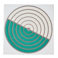
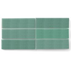
The shapes on the Fireclay tiles are a nod to the couple’s home state: “They remind me of the irrigation circles you see when you fly over Colorado,” says Wendy. The window and island are trimmed in matching mint subway tile.
Cabinets
Walnut uppers deliver on the midcentury look the couple wanted, while lowers painted Extra White by Sherwin-Williams keep the space bright. “We watch a lot of HGTV and love when designers do mixed cabinetry,” says Wendy. “Normally the darker color is on the bottom, but Ashley suggested the reverse, and we really like it.”

.-Battle-on-the-Beach-courtesy-of-HGTV.-.jpg.rend.hgtvcom.196.196.suffix/1714761529029.jpeg)


