Next Up

Jenn Todryk’s Best No-Demo-Required Design Ideas for Every Room

No appetite for destruction? No problem. The oh-so-stylish star of No Demo Reno is all about on-trend transformations that take it easy on your budget and your eardrums.

1 / 25
Photo: RYAN FEDOR

Let’s Not Tear Down This Wall

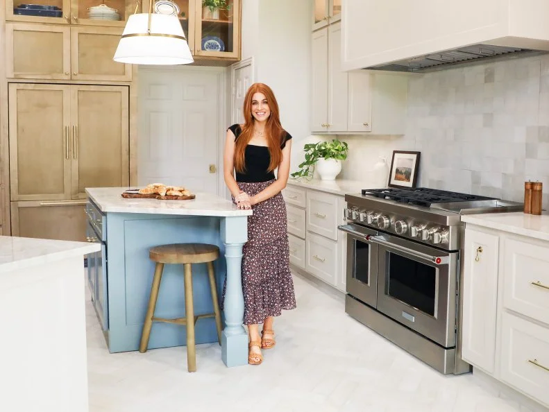
Jenn Todryk powers right past the idea that jaw-dropping transformations require sledgehammers. As social media’s much-beloved design phenom @theramblingredhead, a mom of three and a coffee shop owner, she’s got plenty of chaos in her life already, thanks. No Demo Reno is her ultimate HGTV walkthrough on how to reimagine spaces without taking them down to the studs — and we’ve got the blueprints for her very best designs here.

More photos after this Ad

2 / 25
Photo: RYAN FEDOR. From: Jennifer Todryk.

In the Kitchen: Streamlined Serenity

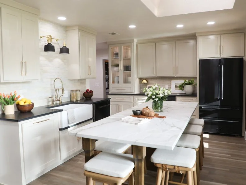
This L-shaped Season 3 kitchen had taken a turn for the worse with a mini-peninsula that killed its flow and cramped would-be cooks. Jenn swapped the stove and the sink to reorganize the space, then replaced the peninsula with a long table that parallels the rest of the room. All-new wood flooring updates the dated white tile, while black stone countertops lend the new cabinetry a hint of crisp, contemporary chic.

learn layouts

More photos after this Ad

3 / 25
Photo: RYAN FEDOR. From: Jennifer Todryk.

In the Kitchen: Ultra-Luxe Island

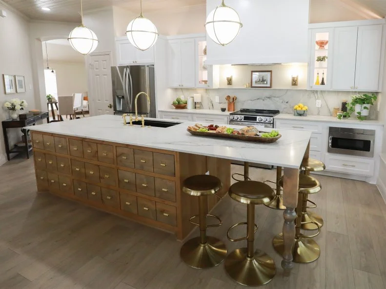
Ah, the mixed blessing of a truly massive kitchen: all the space you could possibly need is also a lot of ground to cover. Jenn gave this potentially cavernous room definition by whisking away a kitchen table that smothered the sunny window seat and bringing in a trio of oversized globes to illuminate a magisterial new island. (A massive marble slab, apothecary-cabinet details, room for six brass-accented barstools, oh my!) In place of unflattering gray paint, a dated tile backsplash and builder-grade fixtures, she’s introduced spectacular stone, architectural sconces and an oversized hood that connects the cabinetry with the soaring ceiling.

more kitchen inspo

More photos after this Ad

4 / 25
Photo: Shannon Faulk. From: Jennifer Todryk.

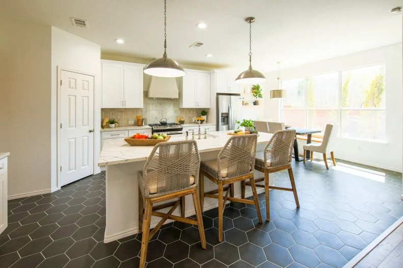
In the Kitchen: More-Is-More Floor

The sizable hex tiles Jenn chose for this Season 2 kitchen makeover hit the once-bland space like a twist of cracked pepper: Now there’s the spice it needed! She replaced a split-level island with a generous and multi-functional one, then brought in a trio of graphic perches to give it an eclectic edge. New custom cabinetry frames an elegant range hood, and soldier-patterned handmade tile replaces ho-hum terra cotta on the backsplash. A pair of gleaming swag lamps, in turn, finish the room like jewelry.

More photos after this Ad

500 Operands are not of the same type: comparison is supported for Number types only.

Operands are not of the same type: comparison is supported for Number types only.

Cannot serve request to /content/hgtv-com/en/shows/on-tv/n/no-demo-reno/photo-galleries/jenn-todryks-best-design-ideas-hgtv.html on this server


ApacheSling/2.7 (jetty/9.4.42.v20210604, Java HotSpot(TM) 64-Bit Server VM 1.8.0_351, Linux 5.10.173-154.642.amzn2.x86_64 amd64)