Next Up

How to Stage Living Spaces When Selling Your Home

February 24, 2021

Potential homebuyers are looking for cozy living spaces where they can relax with family as well as entertain friends. Learn staging secrets that will make your living room, den or family room irresistible to buyers.

Price and stock could change after publish date, and we may make money off these affiliate links. Learn more.
1 / 15

Pare Down Furniture

The most important thing you can do to prepare your home for sale is to get rid of clutter. One of the major contributors to a cluttered look is having too much furniture. When professional stagers descend on a home being prepped for market, they often whisk away as much as half the furnishings so the house looks bigger. You want potential buyers to be able to move around each room without being blocked by furniture. Make sure they can easily access your home’s best features like the fireplace or built-in bookshelves, and make sure they can look out all the windows. Avoid a cluttered look by minimizing items on the coffee table and not piling so many pillows on the couch that nobody can sit on it.

see more photos

More photos after this Ad

2 / 15
Photo: Claire Paquin. From: Claire Paquin.

Make It Neutral, But Not Boring

You’ve probably already heard one of the major rules of home staging is to keep everything neutral. Yes, you want to appeal to the most possible buyers with a palette everyone can agree on, but you also don’t want your house to be dull and boring. If your walls are a bold hue, paint them a middle-of-the-road, light color that will brighten the space. But that doesn’t mean you can’t use accent colors to infuse some personality. Try the 60-30-10 color rule. Sixty percent is the room’s main color – for staging, make that neutral – white, gray, beige, etc. The 30% is your secondary color, which should also be neutral and complement the main color. The 10% is your accent color – this is where you can use a vibrant hue or a soft pastel for a shot of style. In this space, white and gray are used as the primary and secondary colors, while the lilac pillows and chair along with the artwork are the accent. Perhaps let the season help you with your accent color. In cooler weather, add a cozy throw, faux fur or pillows in autumn-inspired earth tones. In spring and summer, accessorize with pastels, floral patterns and a few plants.

learn more

More photos after this Ad

3 / 15
Photo: Amanda Kirkpatrick. From: Hendricks Churchill LLC.

Rethink Furniture Placement

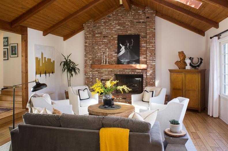
There's a common belief that rooms will feel larger if all the furniture is pushed against the walls, but that isn't the case. Instead, furnish your space by floating furniture away from walls. Reposition sofas and chairs into cozy conversational groups, and place pieces so that the traffic flow in a room is obvious. Not only will this make the space more user-friendly, but it will open up the room and make it seem larger.

see more photos

More photos after this Ad

4 / 15
Photo: Meghan Bob. From: Breeze Giannasio.

Depersonalize

Potential buyers want to be able to picture themselves in your home, and that’s hard to do if all they see are your personal items. Remove family photos, your kids’ artwork, framed diplomas and personal collections. Pack up these items to take to your new home and replace them with generic artwork.

find more ideas

More photos after this Ad