Before and After: A Light, Bright Kitchen Makeover
A dated kitchen in Edmond, OK, gets a stunning update. HGTV Magazine takes you inside.
Sarah Baker
The kitchen in Alesia and Todd Clark's Edmond, Oklahoma, house “never felt like us,” says Alesia. “It had rooster print wallpaper — not exactly the timeless, modern look we like!” Plus, the couple love to entertain and wanted a room that would give them plenty of space to host more friends. Instead of rushing into a redesign when the couple embarked on a whole-house makeover in 2018, Alesia, a pharmaceutical sales rep, insisted on waiting until she created a design plan she loved. They started the nine-month-long kitchen renovation in 2020.
Courtesy of homeowner
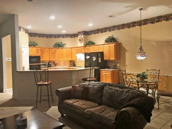
Before: Rooster wallpaper, a grapevine border and yellow-ish cabinets made this space feel stuck in the '90s. The awkward shape of the bar didn't allow for efficient use of the counter space.
After
Sarah Baker
The Details
Clean Palette
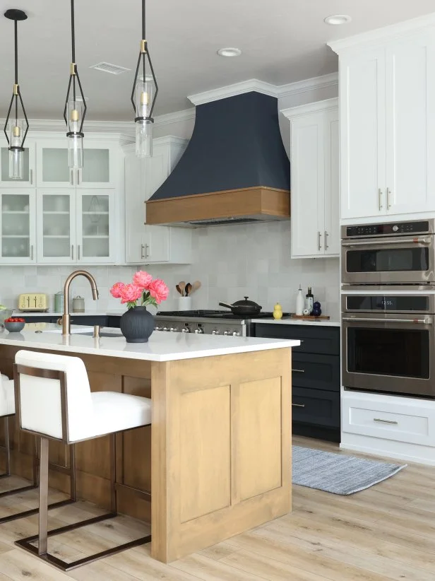
The first step: Give the kitchen sleek, timeless colors. They brightened the space with a mix of charcoal and white cabinets (Iron Ore and Pure White by Sherwin-Williams) and a Bedrosians tile backsplash.
Sarah Baker
Big Island
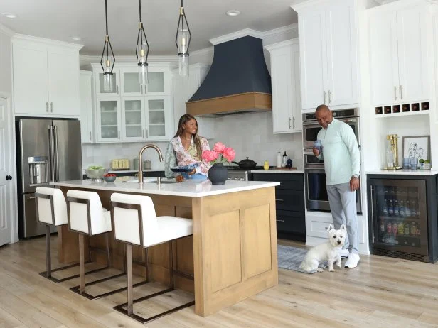
Counter space was No. 1 on the Clarks’ upgrade list. Todd, vice president of a construction company, does most of the cooking. “He likes to invent meals on the fly and needs room to spread out,” says Alesia. Designer Valerie Helgeson from Design Directions suggested the white leather barstools from Sunpan: “They’re prime seating when we entertain,” Alesia says.
Statement Lighting
Alesia didn’t ask for Todd’s opinion on the Bowery + Grove pendants. “I loved them so much, and I didn’t want anyone to tell me no,” she says. Their brushed brass accents complement the Delta faucet and cabinet pulls from Amerock.
Sarah Baker
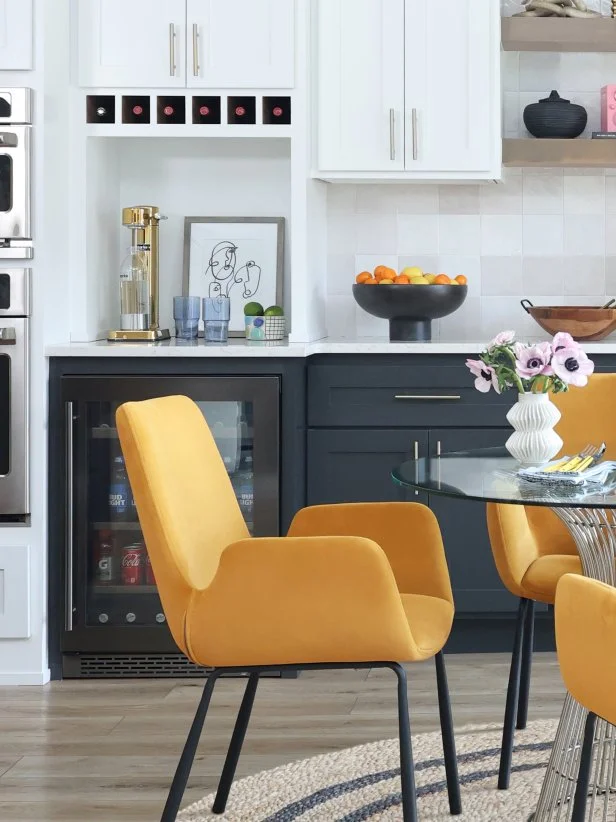
Beverage Station
Alesia makes seltzer here, and the under-counter fridge comes in handy when friends stop by to watch football: It holds beer, water and cocktail mixers. “Todd is very serious about keeping it stocked and neat,” says Alesia.
Courtesy of homeowner
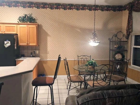
Before: This half of the room was underutilized and lacked style.
Sarah Baker
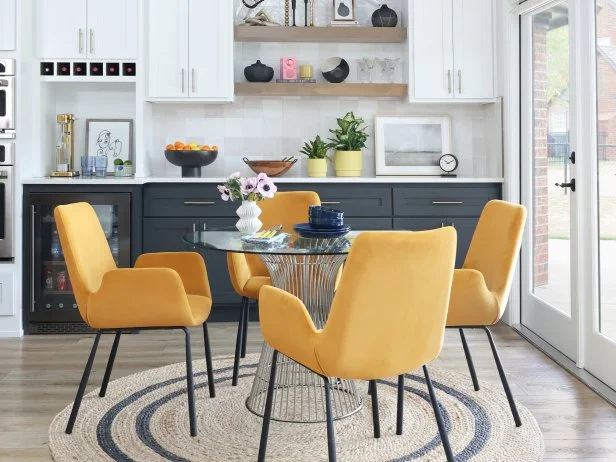
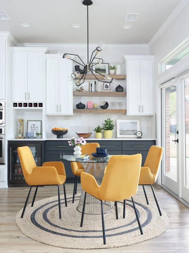
Pop of Yellow
Alesia and Todd chose to continue the cabinetry and countertop to the adjacent dining area for more storage and counter space. A glass table with a wire base keeps this area feeling open and airy, while the mustard dining chairs add pizzazz. The chandelier echoes the pendants over the island to tie everything together.









.jpg.rend.hgtvcom.196.196.suffix/1738869041672.jpeg)











.jpg.rend.hgtvcom.231.174.85.suffix/1738869041672.webp)


